Navigate the app
Surplus adapts its interface to your device and saves appearance preferences locally.
The home screen
After signing in, you land on the home screen. What you see depends on your role:
- Admins see an operational dashboard with today's routes, recent activity, and quick-action links
- Drivers see their assigned routes and personal impact summary
- Partners see their organization's dashboard with upcoming events and history
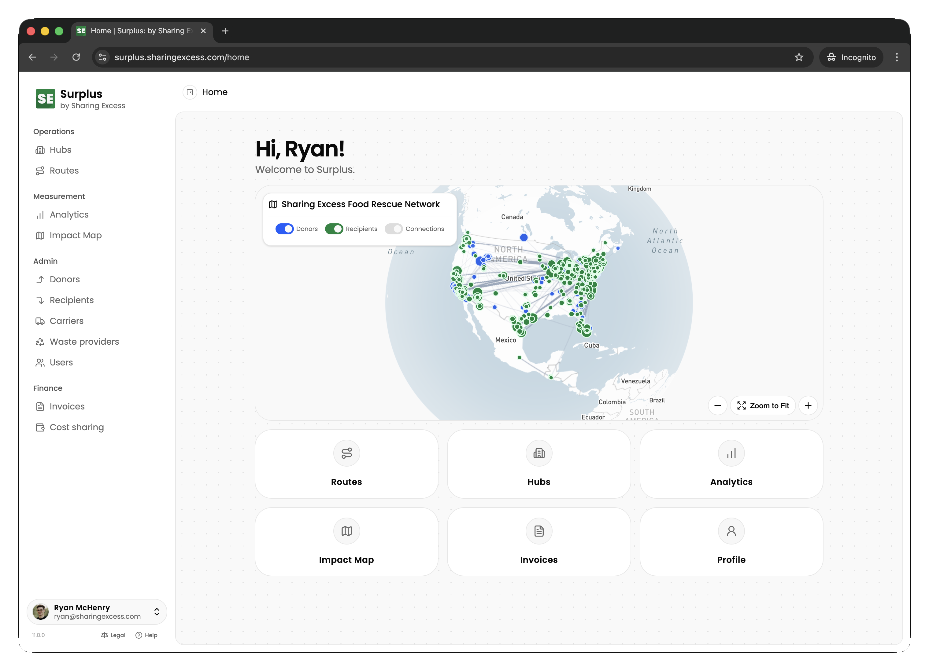
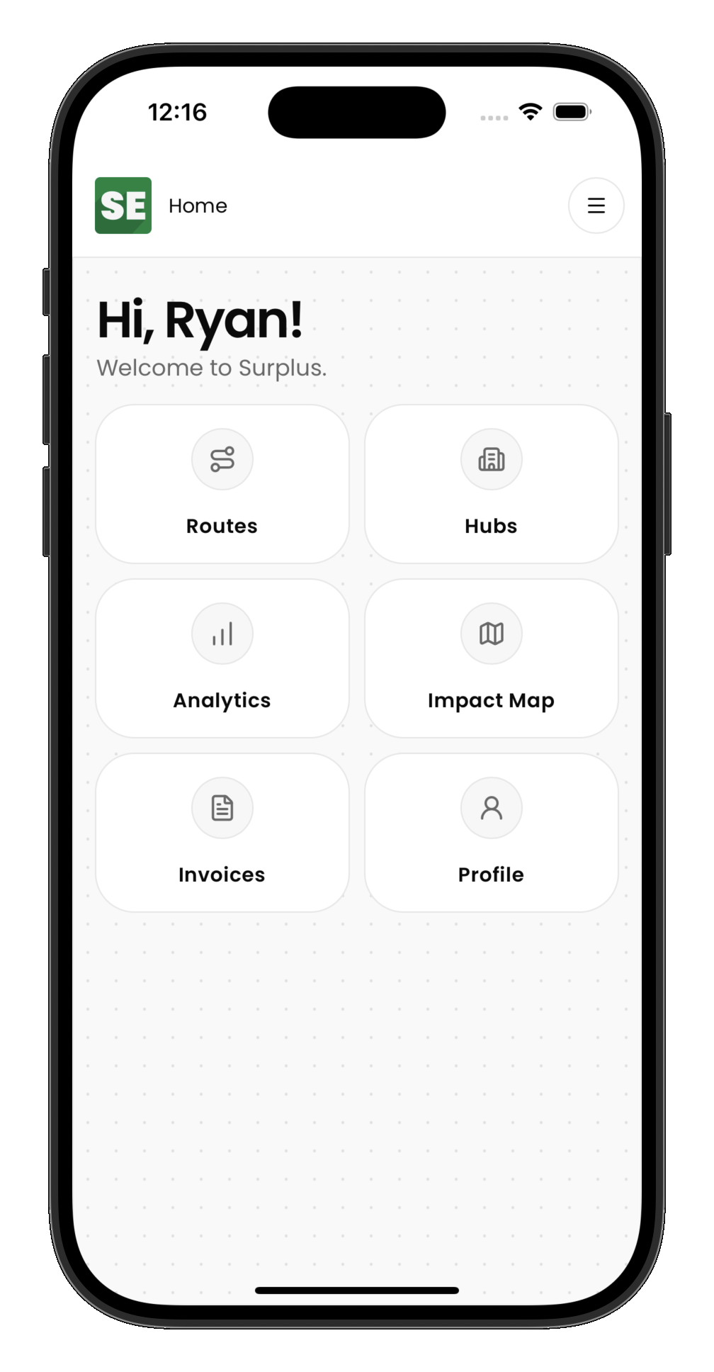
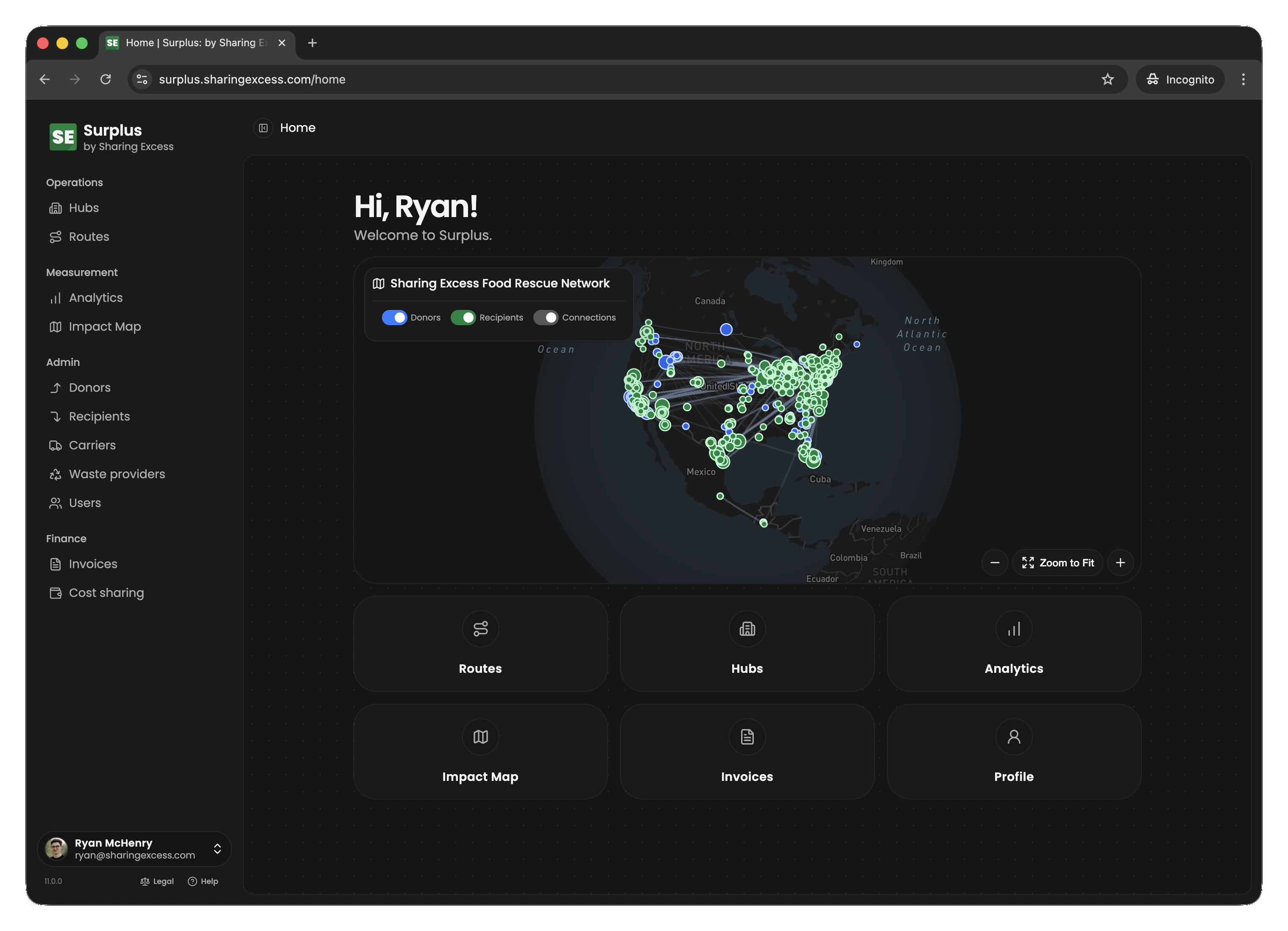
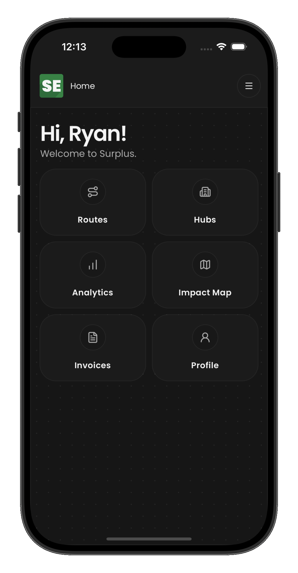
Navigation
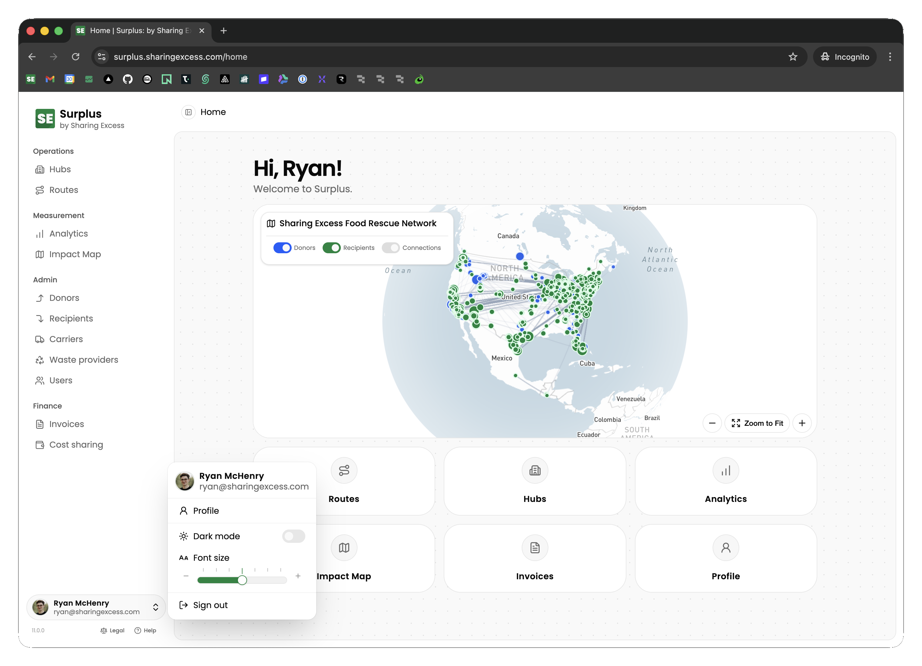
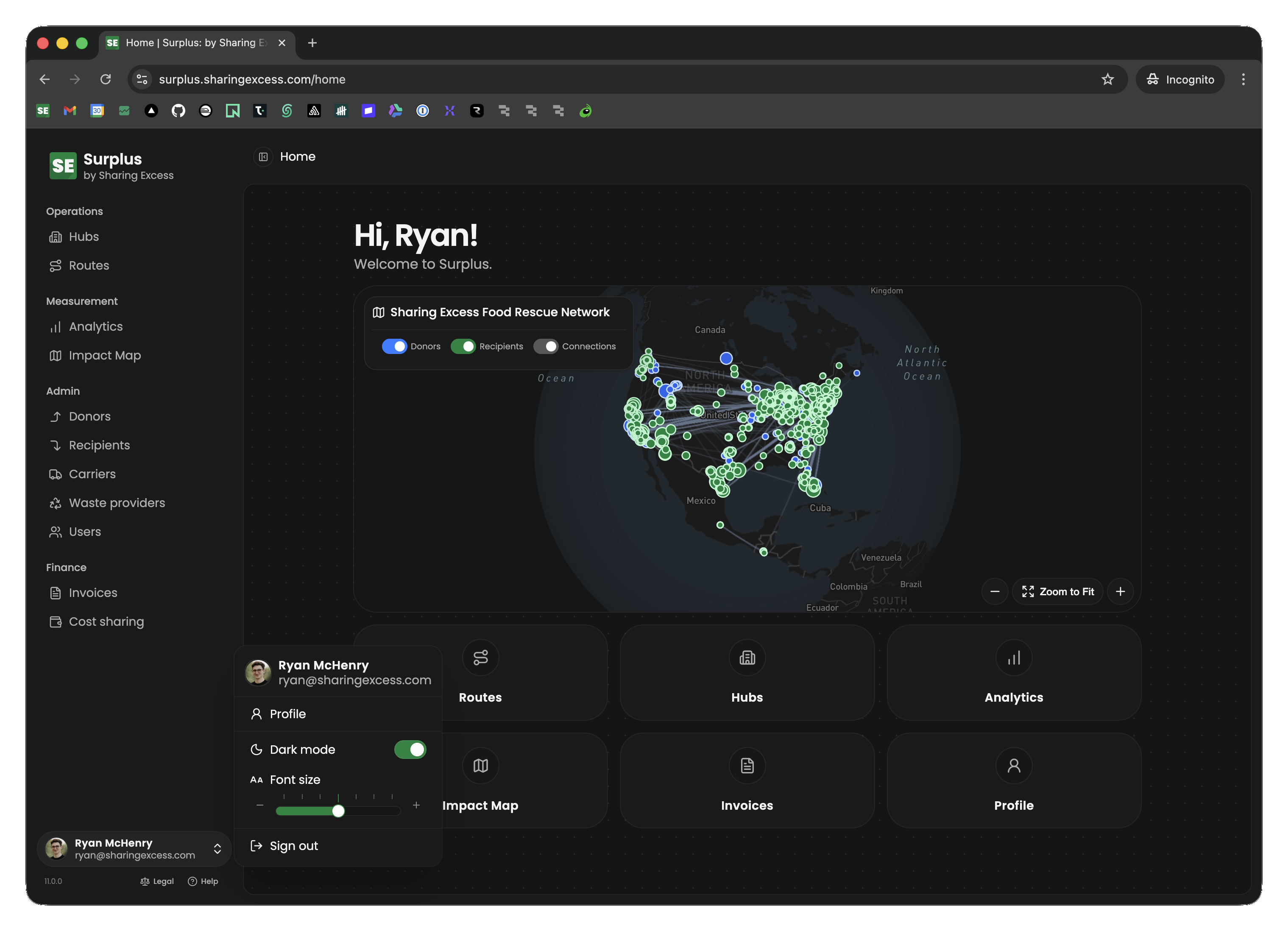
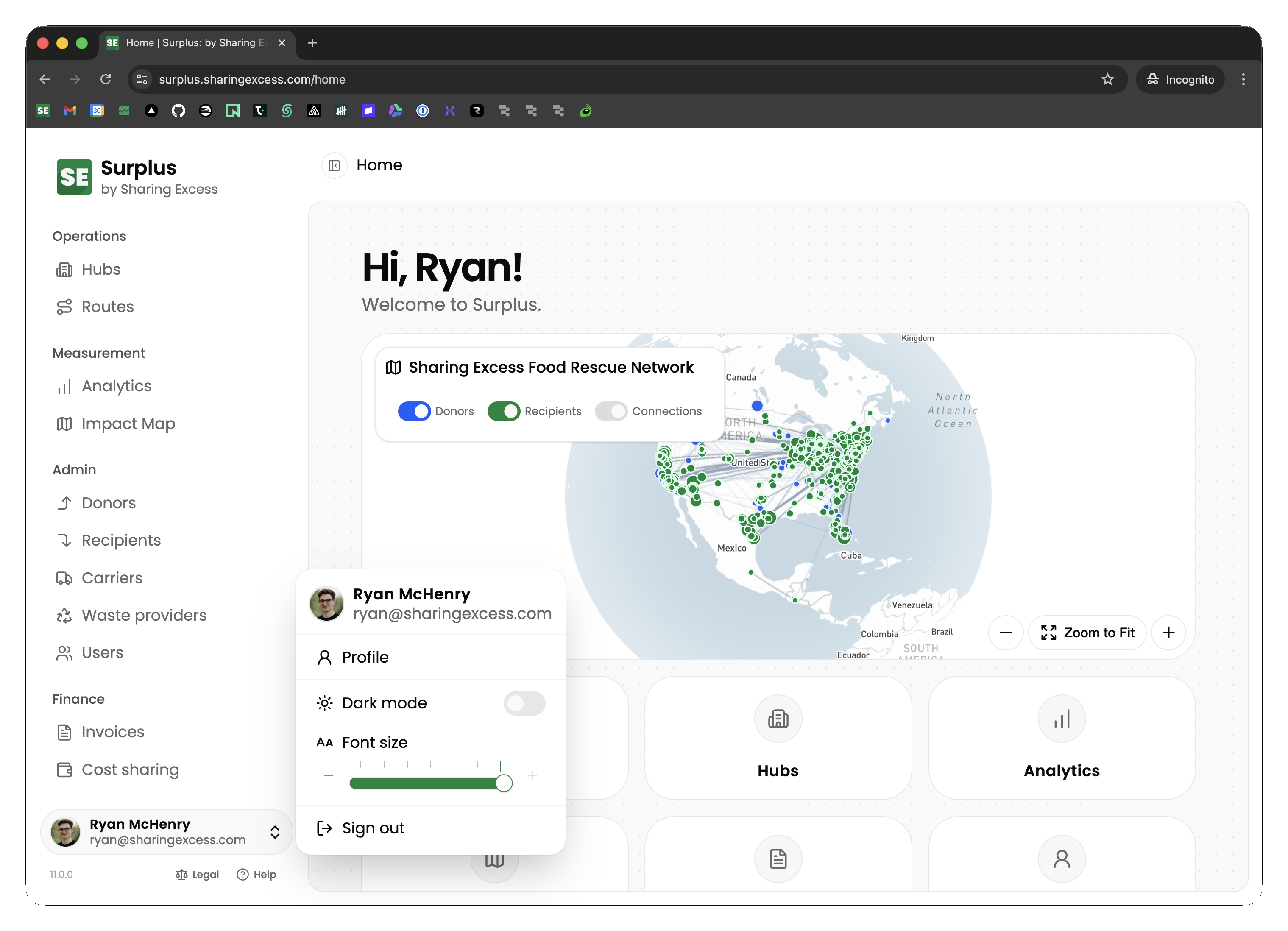
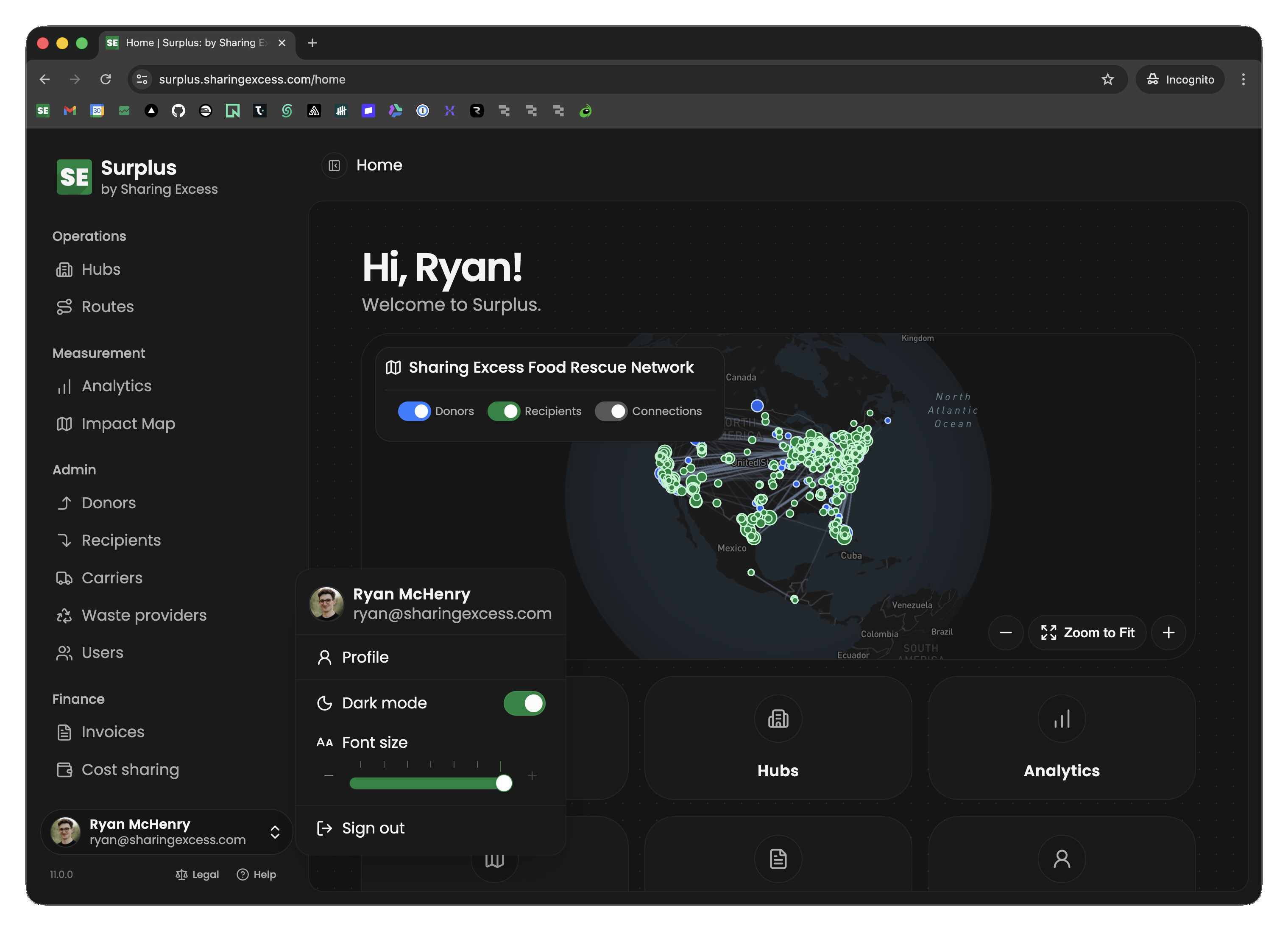
- Desktop — a sidebar on the left provides access to all sections (routes, hubs, analytics, organizations, etc.)
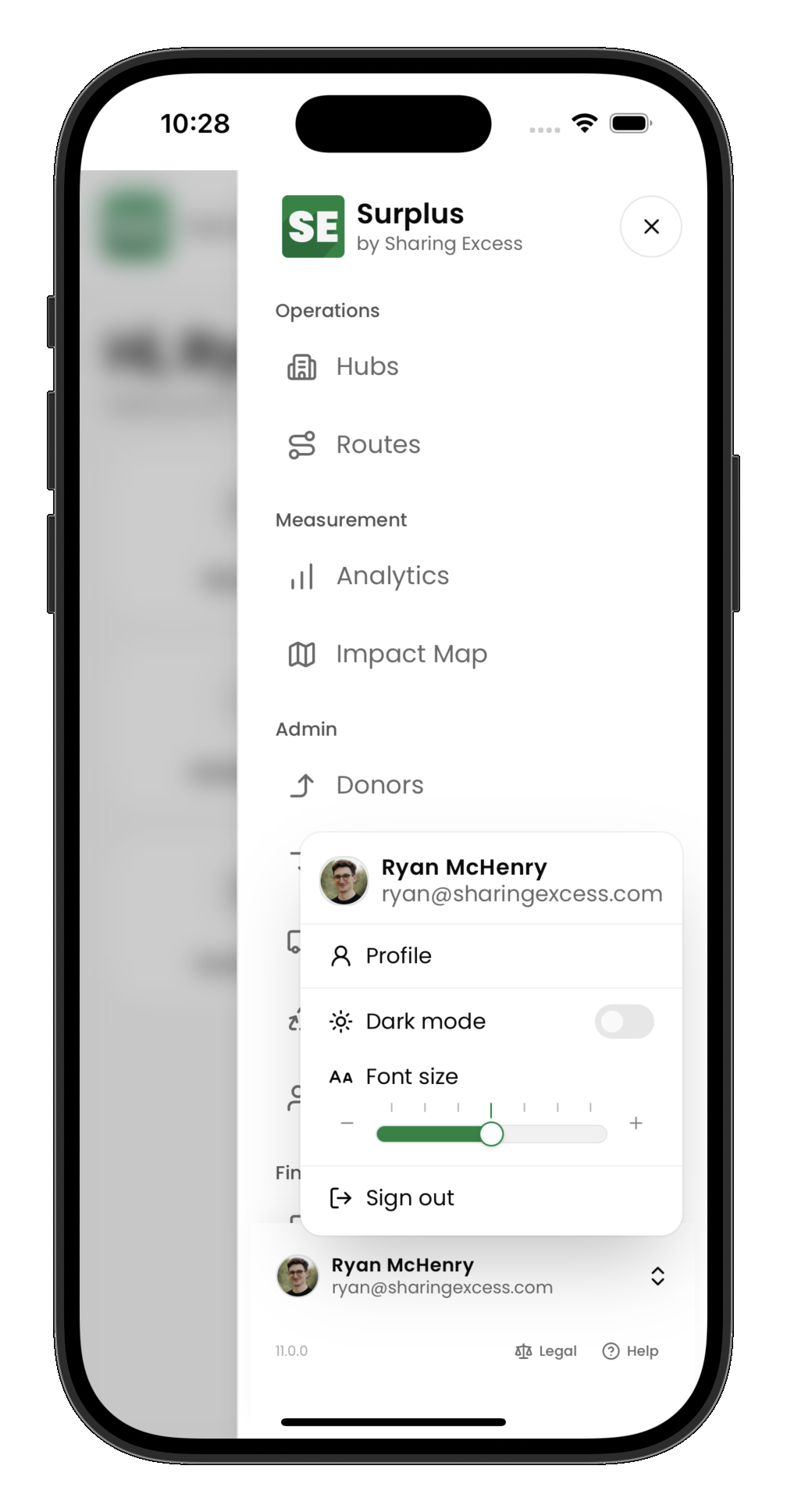
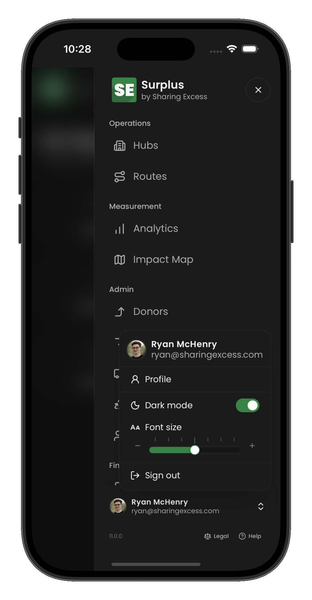
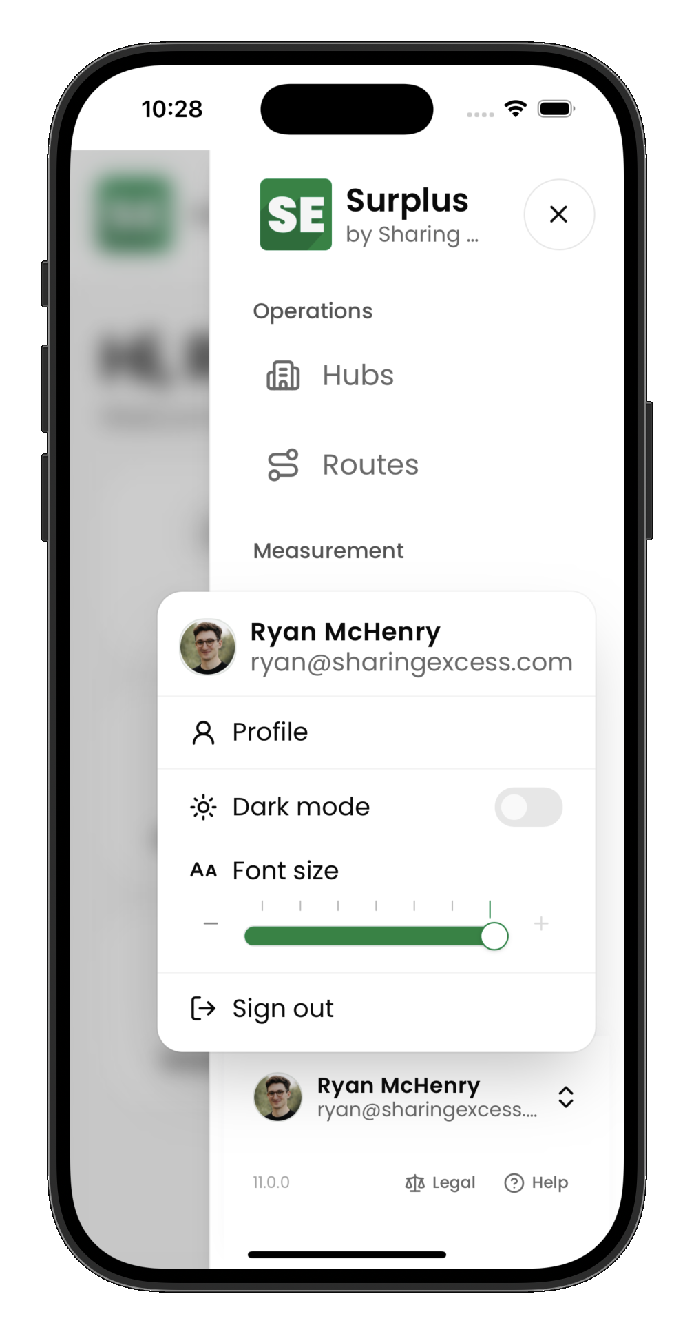
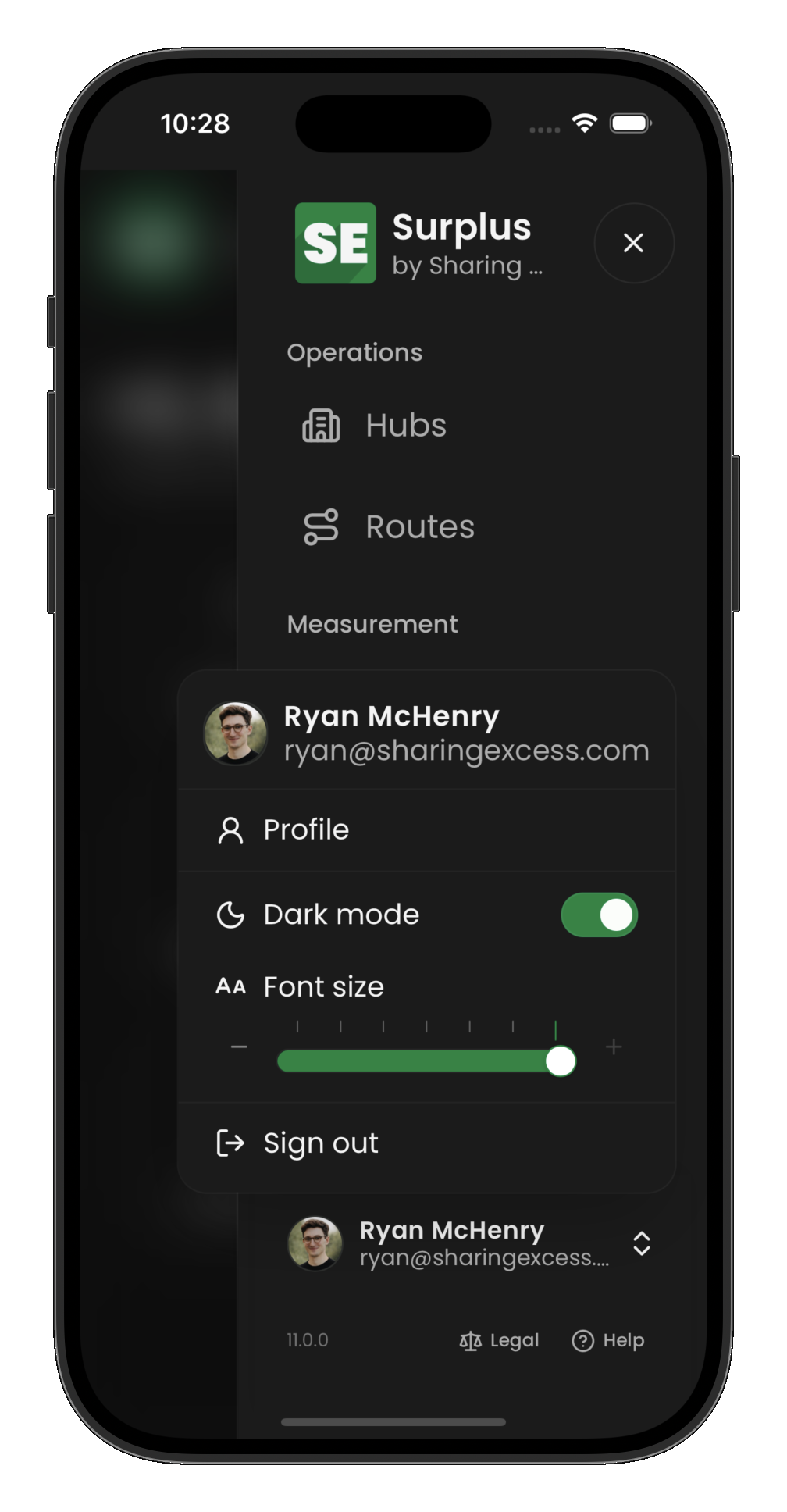
- Mobile — a bottom navigation bar gives quick access to the most-used sections, with a menu for the rest
The sections available depend on your permissions. Drivers see routes; partners see their dashboard; admins see everything.
Search
Press ⌘K (Mac) or Ctrl K (Windows), or select Search at the top of the screen, to find anything in Surplus by typing part of its name, number, or address. Before you type, search lists the last five things you opened from it.
What you can find depends on your role:
- Admins search routes (by number, or the start of one), reference IDs (like
LDSorLDS: 1550), donors, recipients, their locations (by name, street, city, or ZIP), carriers, users, hubs, waste providers, pages, and these docs. Results are grouped by kind, with a tab for each: All shows the first five of each kind, and a kind's own tab shows up to ten. See all opens the full list with your search applied. Where results could live on several pages, like routes and reference IDs, Search with AI opens the assistant with a question ready for you to edit and send - Partners search their own organizations, locations, pickups and deliveries (including the reference IDs on them), pages, and docs
- Drivers search their own routes (by number, a stop's name, or its address), pages, and docs
Appearance and readability
Open your account menu at the bottom of the sidebar (tap your name or avatar). On mobile, open the main menu first if the sidebar is hidden.
Light and dark mode
Dark mode is a toggle in the account menu. When it is off, the app uses the light theme. Your choice is saved on this device.
Font size
Font size uses a slider in the account menu (with − / + buttons). There are seven steps from smaller than default to larger; the middle position is standard. Your choice is stored locally, independent of theme.